
Author of this article: Friso Huystee, scenario, simulation & data analysist
Telling stories with data
Using stories to convey a message, meaning or insight has been part of the human history from the very start. Using narrative instead of stating dry facts just works!
We can and should use this winning formula in the world of data. It is a powerful way of communicating complex information in an engaging and comprehensible manner. It involves the combining of data, visuals, and narrative to tell a compelling story that is driven by facts and insights. We should transform raw data into coherent stories. We owe it to our audience to use data storytelling and help them better understand and interpret the data and thereby making better decisions based on the available information.
A key component of data storytelling are of course visualizations. Stringing together a series of on-point visualizations will represent a large part of the data story. General context and the relation between visuals can be given with a voiceover. Sometimes the story must tell itself when a narrator is absent. In this case use layout, clear titles, labels, and short explanations to highlight key takeaways. Just because we call it a story, does not make it analogous to a detective novel where the important bits are only told at the end.
Data storytelling and high-quality data visualizations ties directly in with the Obeya principles. To adhere to the 10th principle (In the Obeya, we use analytics-driven-evidence to make business decisions) we need a bridge between data and understanding. By its definition a good data story can fulfill this role by not only compressing the data into informative visuals but creating a narrative around the visuals. The presence of the 7th principle (The Obeya visuals provide a logical and practical information and conversation flow) in my view acts as a must-have for structuring the analyses into a coherent flow and just spitting out charts. One of my favorite principles is the 9th (The Obeya is an attractive and available area, in proximity to the workfloor). It will only provide benefit if it is used. An area is attractive not just by having for example good lighting and good accessibility, but the aesthetics of the visualizations also play a role here in my view. When for example charts are cluttered, too difficult to understand of the coloring is a mess, then these will not invite people to come in and learn.
How to make this work? The start is always: what is the story you are trying to tell? First answer that question for yourself before diving into making pretty pictures. Ideally you would define a clear narrative arc with a beginning, middle, and end. This does not mean that you should have all the answers right away, the story could be a narrative about exploration, to facilitate the collective search for key conclusions hidden in the raw data. Write down the key talking points as if giving a talk on the subject.
Some history
Before we go into more detail, let’s discuss some origins of data visualization.
This is where Napoleon comes in: after the failed military campaign of Napoleon in Russia, a Frenchman named Charles Joseph Minard created a beautiful chart that tells this story using multiple metrics:

This revolutionary diagram uses color and size of lines to depict both the route as well as the diminishing size of the army, while also incorporating temperature plots and geographic progression. And all this on a single canvas! The brown line shows the way to Moscow where the loss of life is shown by the line getting thinner along the way. The black shows the retreat. The staggering loss of life is visible on the left where the thickness of the begin and end of the campaign can be compared easily
Let´s move from Napoleon fifty years later to the aftermath of the Crimean war. Florence Nightingale is best known as a war nurse during the Crimean war (1854-1856). More importantly she restructured the field of nursing, established the idea that nursing should be professionally trained and founding a nursing school which became a model for nursing education. She was also a fervent advocate of improving hygiene conditions in hospitals, writing articles in newspapers and letters to legislators. She found that these pleas were more convincing by adding visuals. Below some examples of the charts she created:
In this chart she uses a bar charts showing the difference in mortality between all English males and soldiers (foot guards) for different age groups. By using a signal color (red) for the soldiers, the difference is emphasized.
Het most famous charts are a series of three visualizations (called a Coxcomb or Rose diagram) originally sent privately to Queen Victoria, but later made public. She provided a clear narrative backed by visuals:
- What is the problem? (too many deaths)
- Why is this happening? (showing different causes of mortality, concluding that the impact of bad hygiene is far greater than direct casualties of war)
- What is a solution for this problem? (showing the sharp reduction in deaths after implementing measures to improve hygiene

1. The Problem

In this chart she shows the mortality rate of the British army during the crimean war per month, where each month is represented as one of the 12 wedges. She presents two takeaways in these charts: she shows a benchmark for mortality in the little circle in each chart, denoting the mortality rate in the urban Manchester area not known for its favorable living conditions. It can be clearly seen that the mortality during war time is much higher when compared to Manchester. The second takeaway is that the chart to the left shows lower mortality than the chart on the right. This is from a later time period, after sanitation and hygiene measures had been implemented.
2. The Cause

Building on the realization established in the previous chart that mortality is higher she explains the causes for mortality in this chart. The blue area in the chart shows mortality due to ‘preventable and mitigable’ diseases, the grey and white area from woudns and other reasons. This chart perfectly underscores her vision that lives are lost unnecessarily
3. The Solution
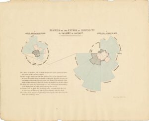
In this chart she dives deeper into the mortality within hospitals. She starts at the wedge in the three o’ clock position and highlights that around the eight o’clock measures for sanitary improvements were started. The mortality rate quickly drops after this
Modern examples of important figures in the data visualization space include Hans Rosling who introduced the power of visualization to the masses with his enormously popular TED talks. Besides key figures, the technological improvement in computing power democratized this space by making the ability to create data visuals available to all. Software like Excel in the 80’s and business intelligence tools like Tableau, Qlikview and Power BI have been instrumental in this movement. Data scientists use open-source platforms to tackle large (unstructured) datasets.
Data visualizations now pervade more than just the business world: journalists use data visualizations to tell compelling stories and provide insights into current events.
Principles for data visualization
- a) Work from Large to Small, from Generic to Detail. This means that you should start the narrative with overarching themes or general observations and subsequently going into specifics and more detail. As with most rules, they beg to be broken: sometimes starting with one piece of detailed information is required to set the stage or bring everyone on the same page.
- b) Visualizations as Means, Not the Goal: The essence of data visualization is not to merely create aesthetically pleasing charts but to use these visuals as tools to weave a coherent and persuasive story. It is a means to facilitate understanding and drive insights. The objective is to increase understanding of the data. Visuals should serve the narrative instead of dominating it.
- c) Consistency: Make sure the audience can quickly grasp the patterns and meanings in the data. Be consistent in your use of color, fonts, and symbols across different visual elements. However, the desire for consistency should not devolve into rigidity. Just because a certain metric or chart was valuable in the past does not mean it should be used indiscriminately in future visualizations.
- d) Clarity: A good chart or visual is easily understandable and should not allow for multiple interpretations. Design it in such a way that the audience immediately gets the message without being overwhelmed by superfluous details.
e) Data to Ink Ratio: Edward Tufte, a pioneer in the field of data visualization, introduced the concept of the data-ink ratio. All ink used will attract the audience’s attention, so make sure that everything you add to a visual enhances understanding. It is the data visualization version of less is more: focus on the essence of the data and remove any unnecessary decorations.
As an example, let’s look at the chart below. On the left, there is a lot going on! A lot of the visual stimuli do not add to the overall message, which in this case is showing the total number of rugby world cup victories per country. Let’s remove the background colors, all axis labels, and the legend (second chart). The message shines through more clearly already. Final improvement is removing the gridlines and showing the number with each column


- f) Use Color Wisely: Color can significantly enhance or detract from a visualization. When used effectively, color can emphasize, clarify, and distinguish data points. However, improper use can lead to a messy or unclear narrative. The choice of color should be deliberate and consistent, ensuring it aligns with the overall story and doesn’t create confusion.
- g) Integrity: A good story will highlight some parts and maybe omit some unnecessary details. The same is true for good visualizations, but only if it passes the integrity test. Is the visual leading the audience to a conclusion that you know to be false, then change it! Using broken Y-axis is a common example of this: although the data is not manipulated, it is leading to give the audience a false impression of the progress or magnitude of a metric.
As a simple example below: The chart on the left looks more dramatic, the underlying metric appears to have increase a lot over the last few year. This effect is mostly because of the broken Y-axis which starts at about 9.5 instead of zero. The chart on the left shows the same data in a more realistic way

How to Choose One Visualization Type Over Another?
Understanding the objective behind the visualization is essential. The goal directs the selection of the most appropriate chart or diagram.
Here are several goals and a charttypes you can use for this:
1. Comparison: Compare one metric against another
Useful chart types:

- Bar/Column chart: Effective for comparing quantities of different categories
- Line chart: Useful for comparing trends among different groups
- Slope chart: compare multiple categories over 2-3 points in time
- Bullet graph: form of column chart that show the progress of a metric measured against a target or budget
- Dumbell chart: shows two values per category. Both progress as well as size relative to other categories can be seen
- Spider/Radar chart: It has multiple axes, where each axis denotes the value of a category. It looks nice, but can be more difficult to interpret
2. Progress: Track progress over time for a metric.
Useful chart types:

- Line chart: Ideal for showing changes in value over a continuous interval or time span
- Gantt chart: Useful for tracking project schedules and progress
- Stacked area chart: showing multiple categories over time that are added to also display the total of the categories
3. Correlation: Determine how strongly metrics are related.
Useful chart types:

- Scatter Plot: Excellent for showing the relationship between two variables
- Bubble chart: A scatter plot with an additional dimension represented by the size of the bubble
- Heat Map: Useful for showcasing correlation matrices
4. Composition: Show what a metric is composed of and understand the subparts.
Useful chart types:

• Stacked Bar/Column chart: Good for comparing the total and also showing the composition
• Waterfall chart: Shows a running total as values are added or subtracted. Often used for breakdown of financial metrics
• Treemap: Effective for displaying hierarchical data as nested rectangles
• Mekko chart: for simultaneously showing both the magnitude as well as the composition of the categories of a metric
• Donut chart: Useful for showing proportions of a whole
• Waffle chart: the square version of a pie/donut chart showing composition of a metric on a grid of squares where the relevant part is colored
5. Distribution: Understand the underlying distribution of a metric.
Useful chart types:
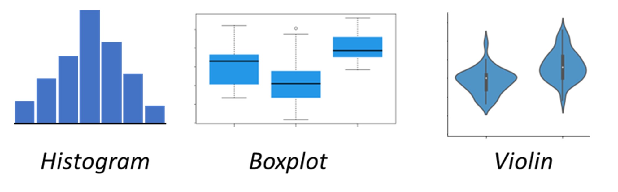
- Histogram: Ideal for showing the underlying frequency distribution of a metric
- Box Plot: Useful for showing the statistical distribution of a dataset
- Violin Plot: Combines aspects of box and density plots to show the distribution of data
6. Other: various charts used for specific purposes
Chart types:

- Sankey chart: used to show the flow of multiple variables from one state to another
- Chloropleth map: geographical map where the color of a subsection of the map denotes the magnitude of the metric
Tips & Tricks for practitioners
Keep it simple! Just because you can, does not mean you should. Do not go overboard on color or other visual effects. My favorite example of the opposite of simple:

Example of the opposite of simple
- Avoid pie charts like the plague. This a bit of a pet peeve of mine, but for a reason. Pie charts are still ubiquitous but can lead to the wrong conclusions or conclusions can be missed where other chart forms will pick these out. Especially in cases where the values of categories are in the same range.
In example below it is hard to see the difference between A and B or C. from the column chart this is immediately clear.

- I have so far not mentioned the whole process that precedes visualization: from data design to data cleaning to ultimately analysis. To use the visualizations continuously it is imperative that the underlying data is structured in such a way that updating the visual is easy and seamless. If not, then visuals will be updated less frequently and thereby losing relevance
- Also make sure that the visual is aligned to the audience’s level of knowledge and context. The goal is for the visuals to be understood without room for multiple interpretations. Clarify terms or metrics that might be misunderstood by your audience
- Be open for iterations: use the engagement of the audience to improve the story and visualizations. Seek the audience’s feedback and make it a collaborative effort
Who should do it?
Finally, let’s discuss who should take on the role of creating data visualizations and who are becoming the storytellers. In my opinion, data visualizations are most impactful when designed by individuals closely involved in the data generation process. Those who understand the nuances of the data can create the most compelling and accurate narratives. While these individuals may not always possess advanced graphic design skills, entrusting this task to people farther from the relevant processes may enhance visual appeal but potentially compromise flexibility and precision. The goal should be to elevate the median quality of data visualizations, integrating it into everyday work rather than treating it as a sporadic effort.

Related Articles

Making the Invisible Visible – How Obeya Drives Safe Execution on Complex Capital Projects
Author of this article: Nynke Bel Nynke Bel is ...

Strategy Execution with Obeya-driven Portfolio Management
Author of this article: Felice Davies, Jelger Haanstra and ...

No Title – No Problem
Author of this article: Berrie Duijx Berrie Duijx is ...
